The Urine Wheel
A couple of years ago in front of a room full of my professional colleagues I disclosed my love of the urine wheel. That’s the image you see on our home page in the “logo” spot.
Why do I love a urine wheel? Well, it’s a long, complex story so I’ll do the tl:dr version as it specifically applies to this class. The urine wheel is a classic example of sophisticated information design. It’s long history and use in medieval and early modern medicine also gives it a little bit of a cool factor. (at least in my mind 🙂
Not to mention, the modern version of uroscopy is still done in pretty much the same way. (But that’s a discussion for another day.)
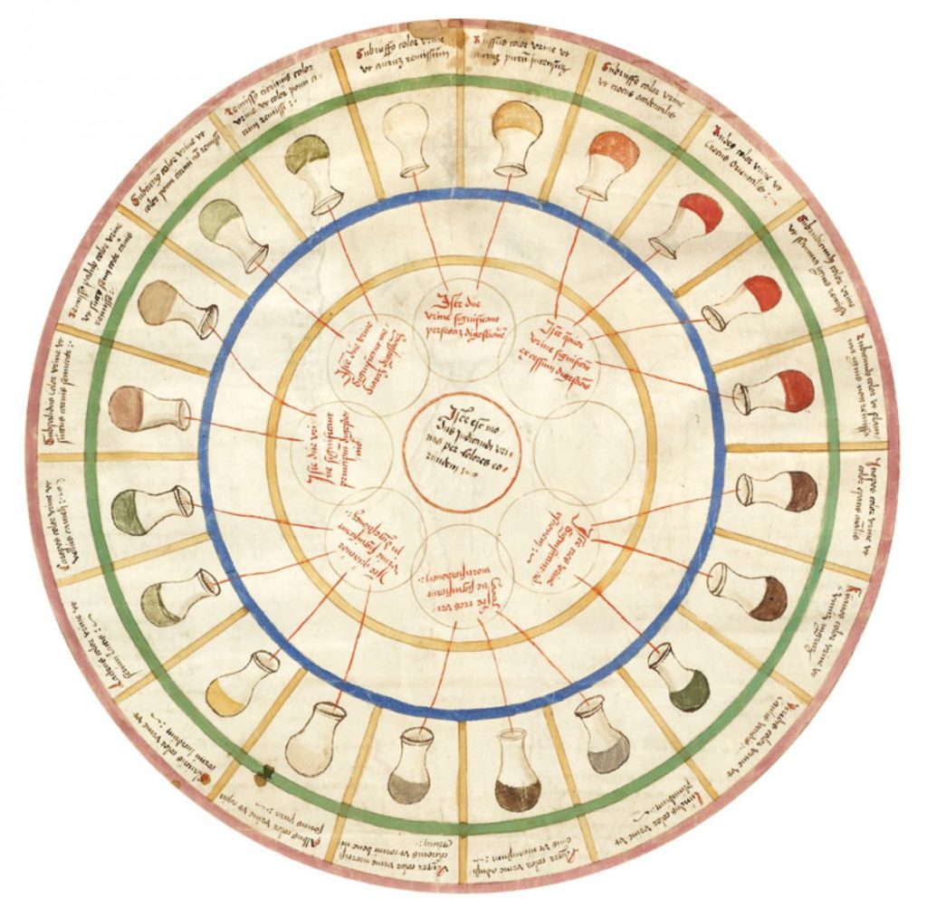
What makes this a great historical example of information design is that it takes a lot of information and it makes it’s usable at a glance for a specific purpose and audience.
It also uses color and design effectively, along with the combination of words and images. We’ll talk more about it on the first day of class, but this is a brief overview as to why there’s a urine wheel on the home page of our course website!
Let me know if you have specific questions. I’m happy to answer them.